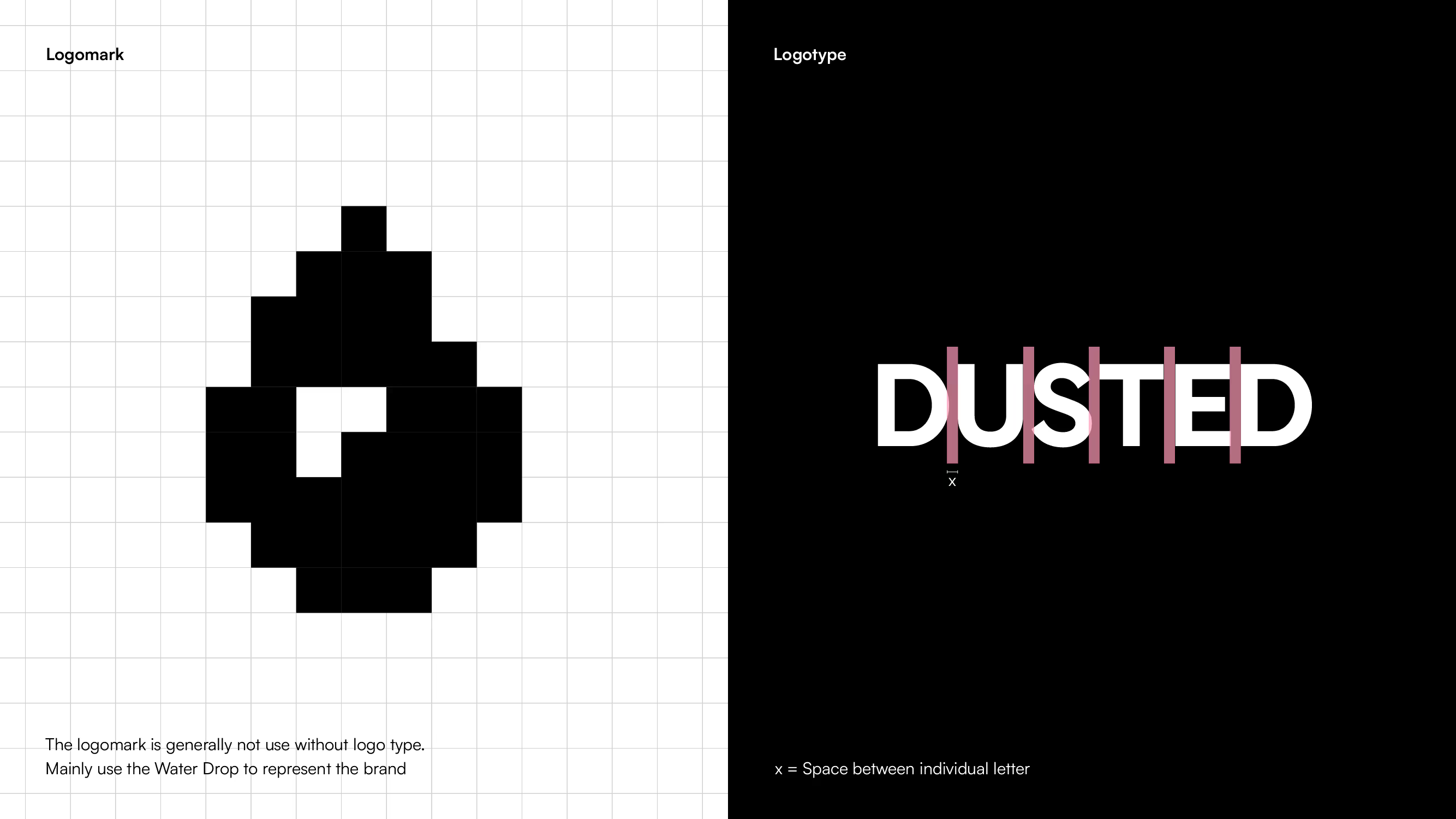
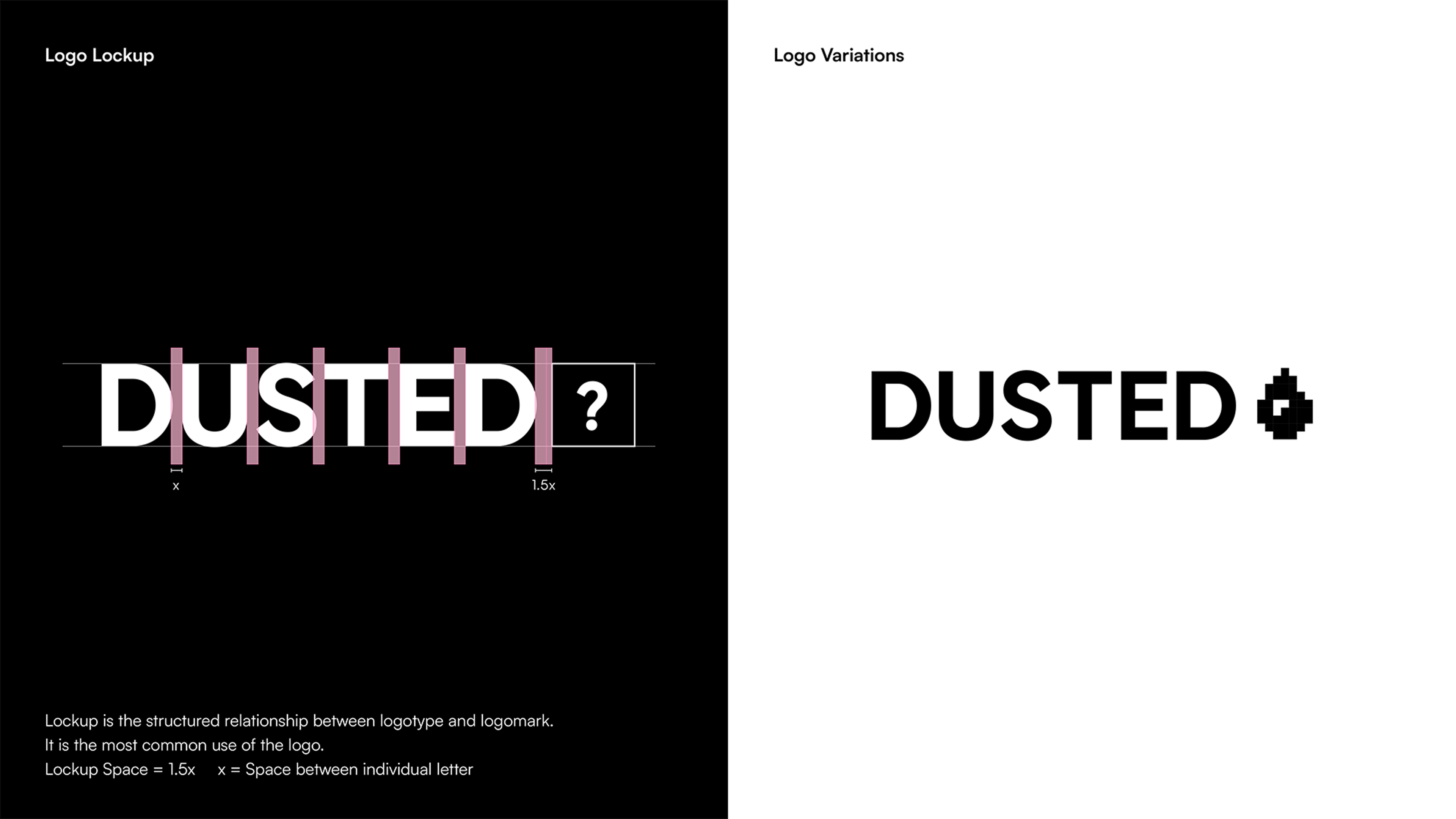
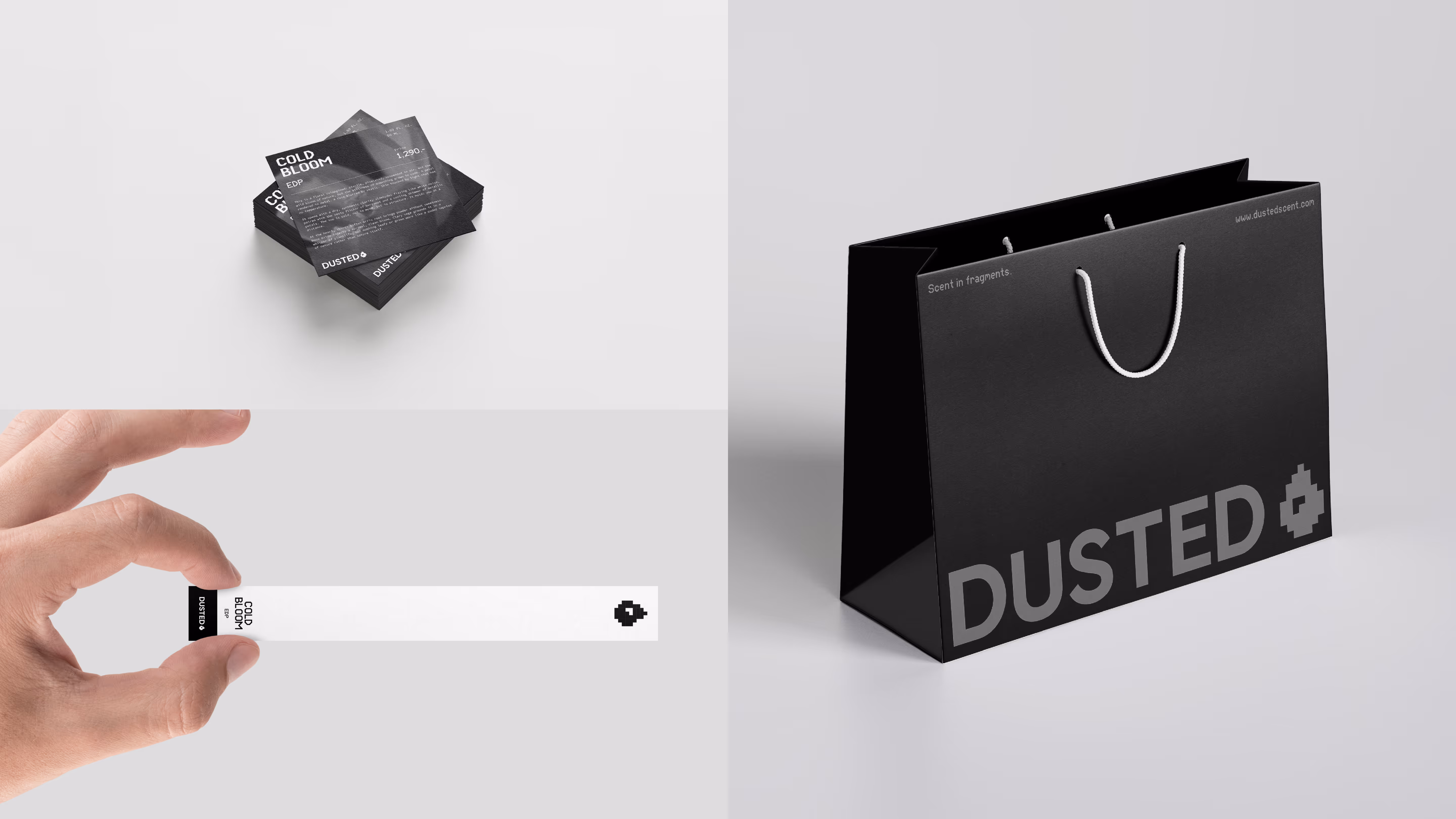
The DUSTED logo combines a custom logotype with a distinctive logomark, creating a bold and versatile visual identity. The logomark, based on a modular pixel grid, serves as a symbolic fragment — echoing the brand’s theme of deconstructed sensory experiences. It appears in multiple variations derived from the brand’s icon system, giving it flexibility and a strong visual presence across different applications. The clean, grid-based alignment of the logotype ensures consistency, while the icon variations add a layer of expressive dynamism.
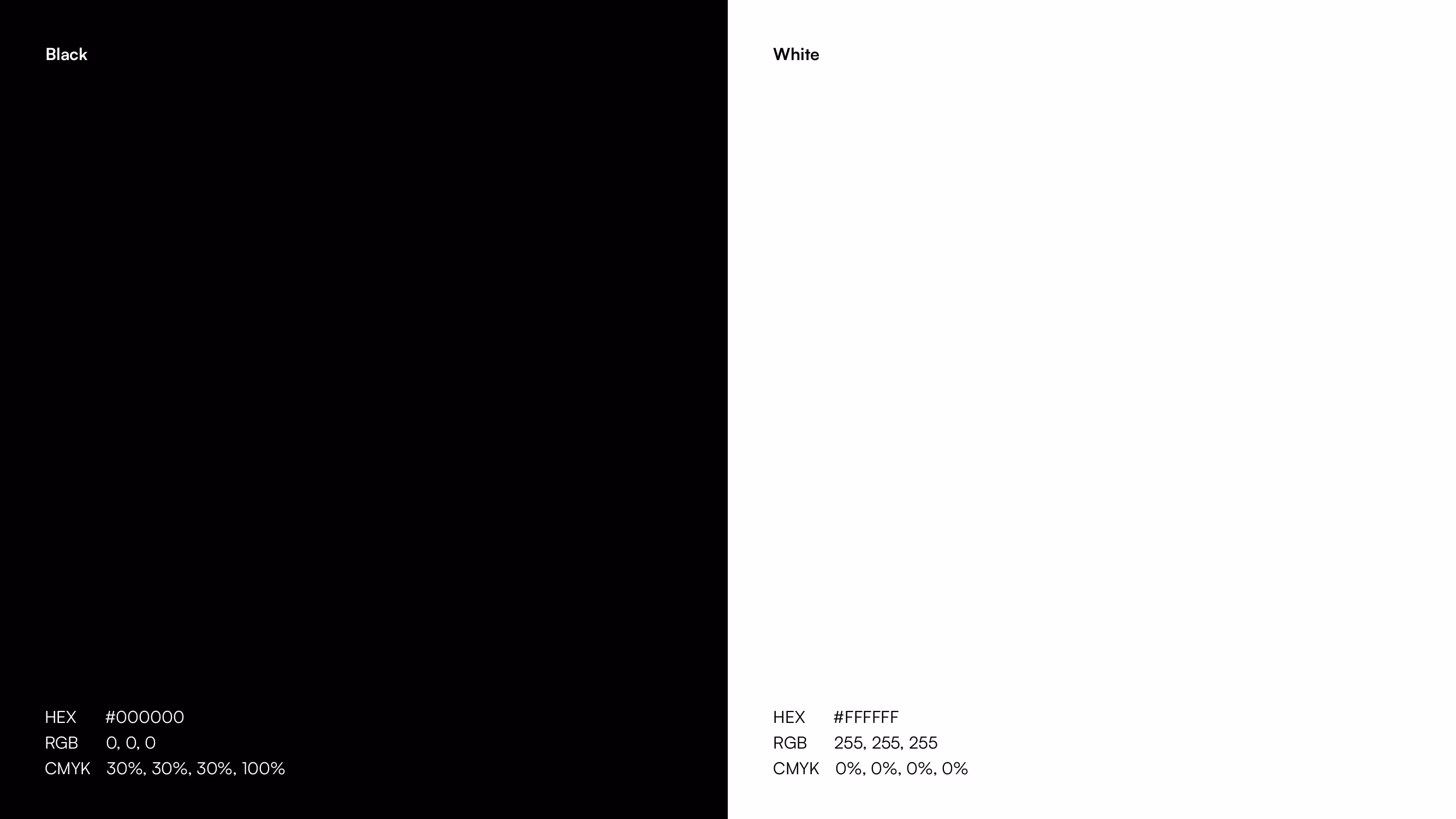
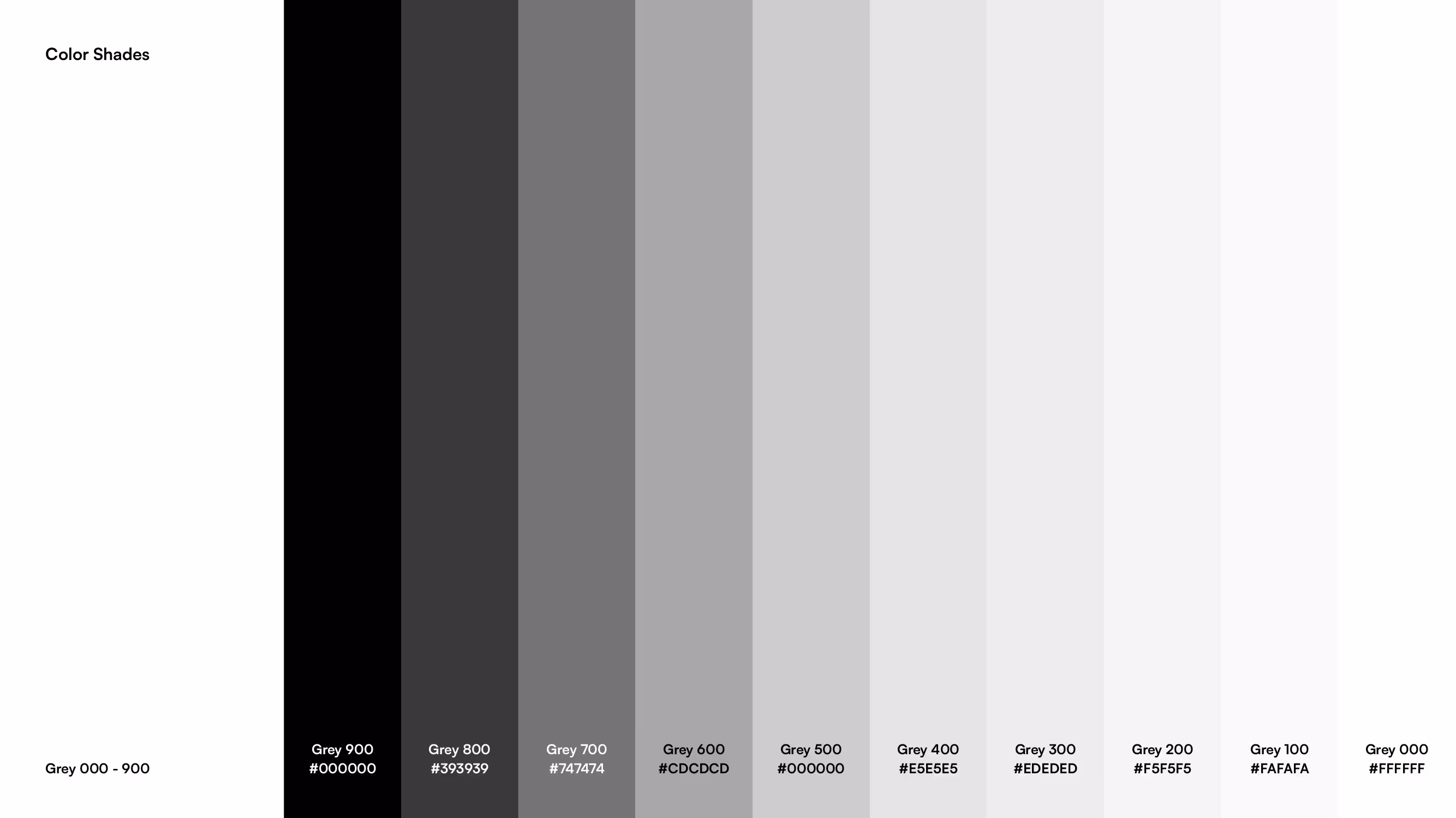
The DUSTED visual language relies on a minimal monochrome palette. Only black and white are used to convey a sense of clarity, purity, and modernism. To avoid visual flatness, a gradient of grey shades is introduced to add subtle depth and tonal variation, enriching compositions while maintaining the brand’s minimalist aesthetic.
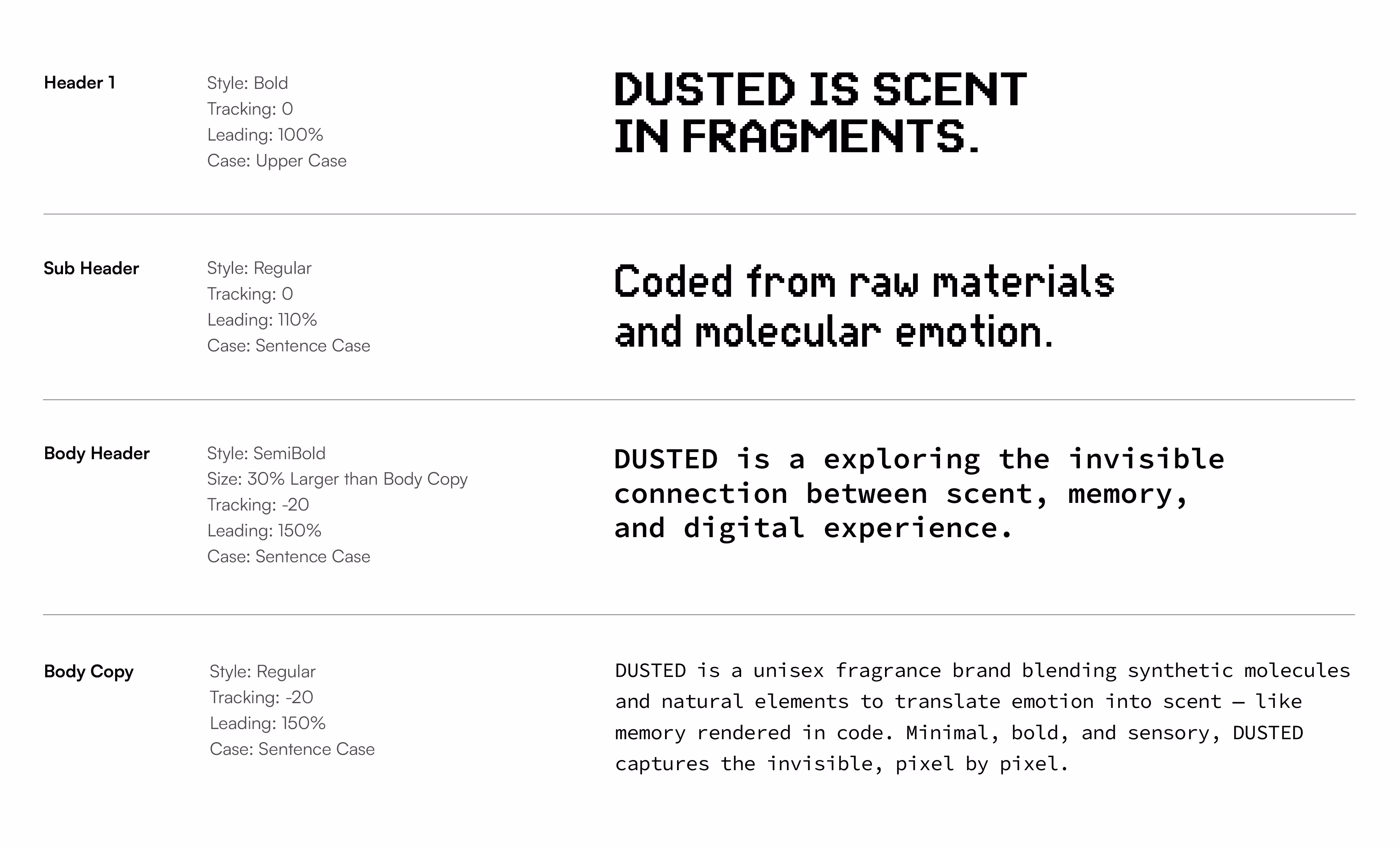
In terms of typography, DUSTED uses two contrasting typefaces:
- Heading Typeface: A bold, pixelated display font that brings a retro-digital aesthetic aligned with the concept of fragmented scent.
- Body Typeface: A digital-native monospaced typeface inspired by source code, reinforcing the technological, synthetic nature of the brand. This pairing of fonts mirrors the balance between emotion and computation at the heart of DUSTED’s philosophy.
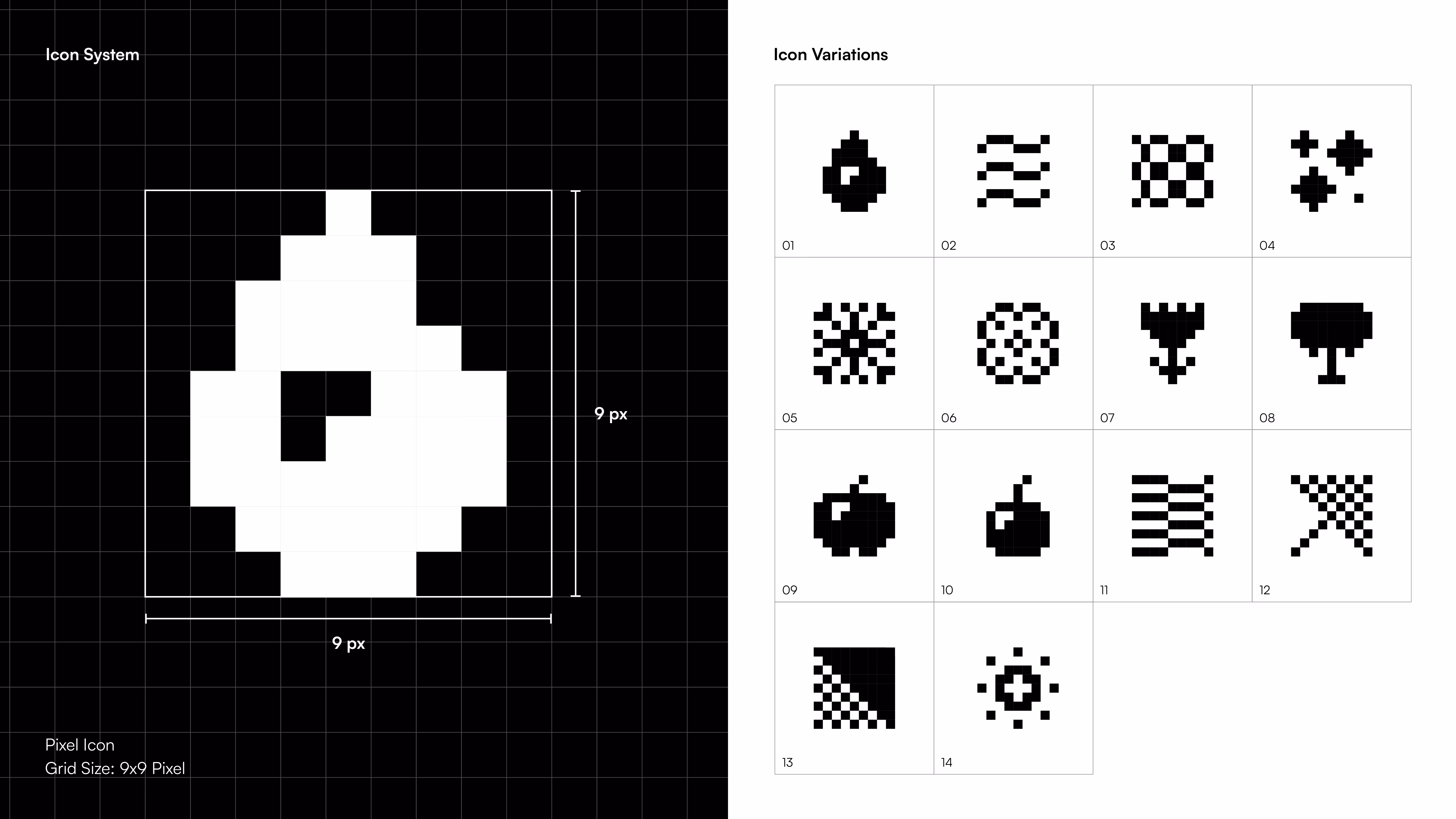
The icon system is constructed on a 9x9 pixel grid, forming the foundation for DUSTED’s graphic language. Icons range from abstract to representational, including elements such as sun, flower, water drop, fruit, and wind. This duality allows the brand to evoke both metaphorical and literal connections to ingredients and sensations. Each icon functions as a visual "fragment" — further reinforcing the brand’s narrative of scent being reconstructed from molecular elements.
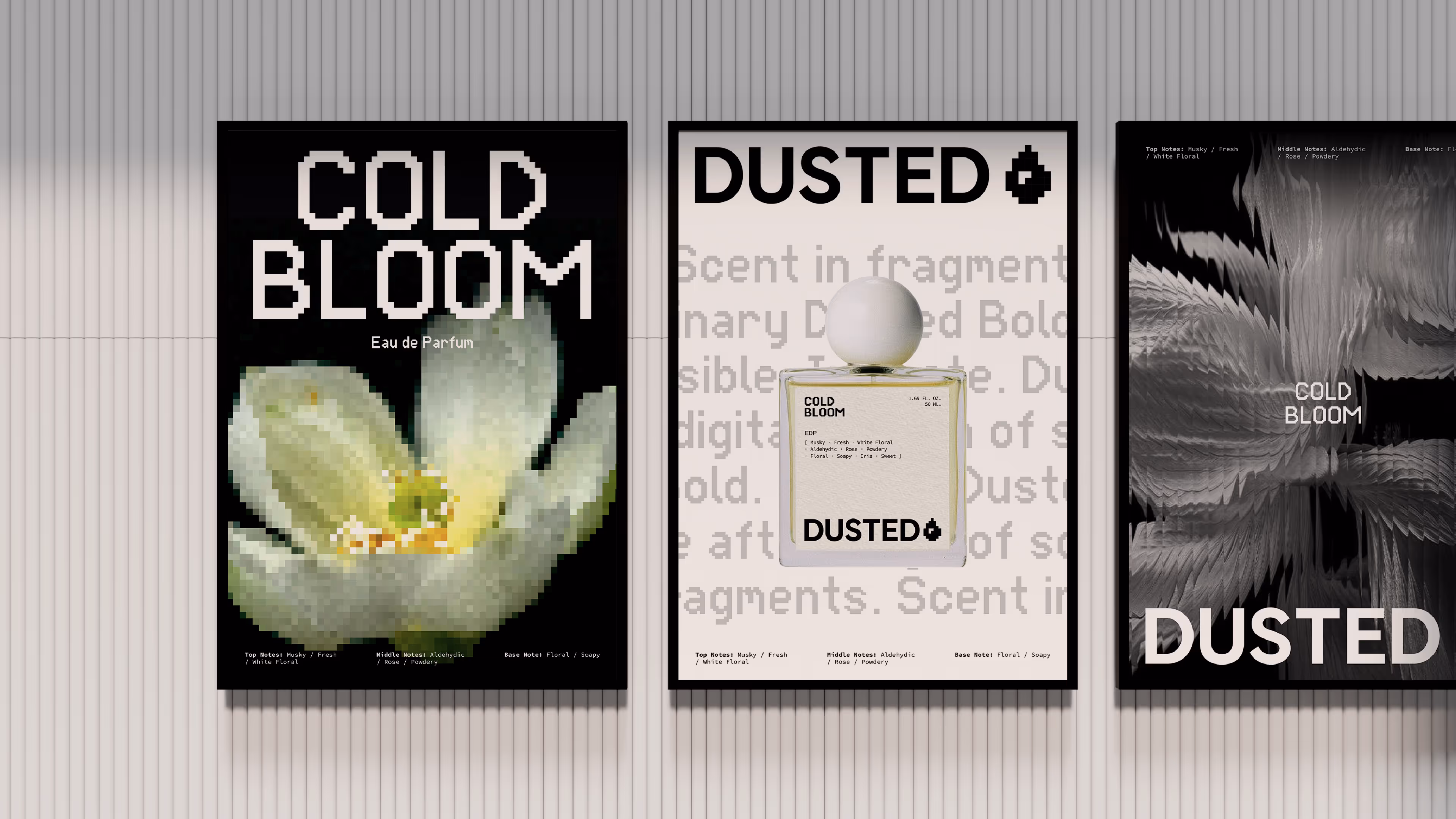
To preserve the brand’s conceptual integrity, real imagery of perfume ingredients (e.g., flowers) is transformed through pixelation or glassmorphism techniques, creating a layer of abstraction. This design choice subtly distorts the natural form, aligning perfectly with the idea of translating raw, natural elements into digital and molecular interpretations.